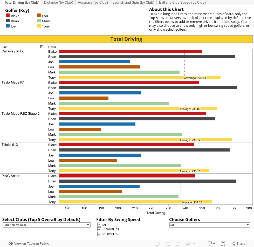
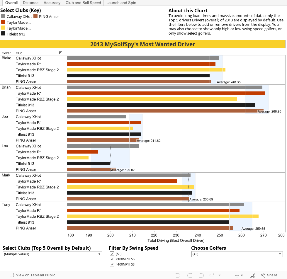
While some are content just to look at rankings and scores, hardcore guys like you want to dig a little deeper into the data. The two charts below were created using the data we pulled from our launch monitors during the MyGolfSpy 2013 Driver Test. It's the foundation that our results were built on.
The first chart is sorted by Individual Tester. It will allow you to look at each individual testers (or all testers) to see how well he hit a particular driver. To keep things as simple as possible, we've selected the Top 5 Overall Drivers by default, you're of course free to add and subtract whatever clubs you're most interested in examining more closely.
Maximizing the Potential of the Charts
:: These charts are dynamic. As you add or remove testers or clubs, all relevant data will be updated accordingly.
:: The Club Selector drop-down (bottom left) will allow you to add or remove additional clubs.
:: You can also use the Swing Speed filter to isolate our high and low swing speed testers.
:: Please take note of the dotted black line that runs through each set of bars. That line represents the average value for the data set. As you add or remove clubs to the data set it will dynamically update to show you the average for the selected clubs.
:: The area shaded in blue defines a range one standard deviation above and below the average. In simple terms you can think of the shaded area as the normal performance range for each tester (this is particularly useful when analyzing how a single tester performed with each of the 17 drivers in the test).
:: Anything outside of the shaded area can be considered exceptional. Of course, anything on the wrong side of the shaded area should be considered an exceptionally bad result.
:: There are multiple tabs located at the top of each chart. Be sure to cycle through each one to find the specific data you might be interested in.
:: Hovering over an axis label will present the option to sort high to low, low to high, or alphabetically.
:: Just for fun we've included the longest drive that our testers hit with each club.
Individual Tester Performance Charts
Individual Club Performance Charts
The individual club performance charts give you a slightly different view into the data. Instead of beginning the sort with the golfer, it starts with the club. This allows you to easily see how each tester performed with a specific driver or drivers.
Want to see just the Callaway driver, you can do that. Do you want to see how our senior tester (Lou) performed with the Top 5 Drivers, you can do that to.
:: The individual Club Performance Chart uses the same sorting and filtering tools as the Individual Tester Chart.
:: As with the Individual Tester Charts, averages are calculated dynamically as testers are added or removed from the sort.