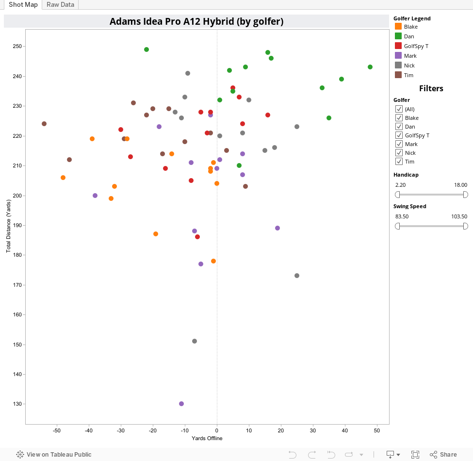
From day one of the new review system we've talked about not only the importance of data, but the importance of actually being able to share that data with our readers. What you see below is each and every shot that our 6 golfers took during the testing process for the Adams Idea Pro A12 Hybrid. Hovering over any point on the map will give you all the pertinent details of that particular shot. Raw averages were compiled for each and every piece of data we culled from our simulators. If the screen looks a bit cluttered for your taste you can simply de-select any golfer to remove his data from the charts.
NEW: Tabbed Navigation
We've separated our shot map, and the graphs of the raw data into separate tabs. We hope this will make viewing the data a bit easier. From our perspective, it opens up the door for including more data down the road (we were pretty much maxed out under the single page display).
On each of the bar graphs, we include two reference lines. The dotted gray line will always represent the average for all golfers for whom we collected data. The dotted black line represents the averages for only those golfers you select. This way you are able to quickly see how the numbers from an individual, or sub-set of testers compares to both each other and the testing group as a whole. We also include sliders which allow you to filter golfers based on driver swing speed and handicap.
What to Look For
Unlike some of the other clubs we've tested this season, the Idea Pro A12 Hybrid shows a relatively even distribution across both sides of the fairway. Despite producing slightly less in the way of clubhead speed, our testers generated more ball speed than they did with the Cleveland Mashie Hybrid. Backspin and sidepin numbers were also reduced.
If you don't see a chart below, please refresh your browser.
How are we doing?
If there's anything you'd like us to try and add to these interactive pages we generate, stop by the MyGolfSpy forum and let us know. If it's possible, we might just do it.