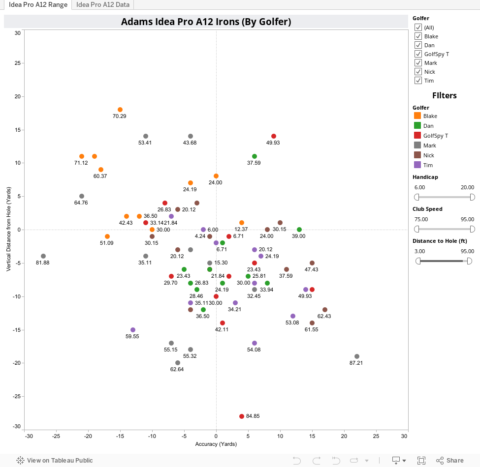
(Interpreting the Data)
From day one of the new review system we've talked about not only the importance of data, but the importance of actually being able to share that data with our readers. What you see below is each and every shot that our 6 golfers took during the test process. Hovering over any point on the map will give you all the pertinent details of that particular shot. Raw averages were compiled for each and every piece of data we culled from our simulators. If the screen looks a bit cluttered for your taste you can simply de-select any golfer to remove his data from the charts.
On each of the bar graphs, we include two reference lines. The dotted gray line will always represent the average for all golfers for whom we collected data. The dotted black line represents the averages for only those golfers you select. This way you are able to quickly see how the numbers from an individual, or sub-set of testers compares to both each other and the testing group as a whole. We also include sliders which allow you to filter golfers based on driver swing speed and handicap. Finally, for reviews like this which use radius-based scoring, we've also added a new slider that gives you ability to filter shots based on their proximity to the target (the hole).
Some Key Things to Keep in Mind
- The hole is always located where the X and Y axes intersect (0,0). It won't always be in the center of the screen since the software automatically adjusts to better display the relevant data (the selected shots).
- If you don't see the intersection of the X and Y axes, you've filtered down to some fairly poor shots (probably mine)
- As always, shots are color coded by golfer
- The X and Y axes labels are in yards, however, each shot is labeled with its distance from the pin in feet
- Charts for Accuracy and Consistency, which are the basis for our performance score, are now listed first in the comparative data section
- The "Yards Offline" chart refers to distance from the centerline without regard to distance (similar to our driver tests)
- The Distance charts refer to carry, roll, and total distance without regard for the hole location.
What to Look For
While distance control was a bit of an issue for some of our testers (Dan said he found himself between clubs), left to right dispersion was actually very good (better than most). Not surprising considering the design, we also observed launch angles that were slightly less than some others we've tested.
If you don't see an interactive chart below, please refresh your browser.
How are we doing?
If there's anything you'd like us to try and add to these interactive pages we generate, stop by the MyGolfSpy forum and let us know. If it's possible, we might just do it.