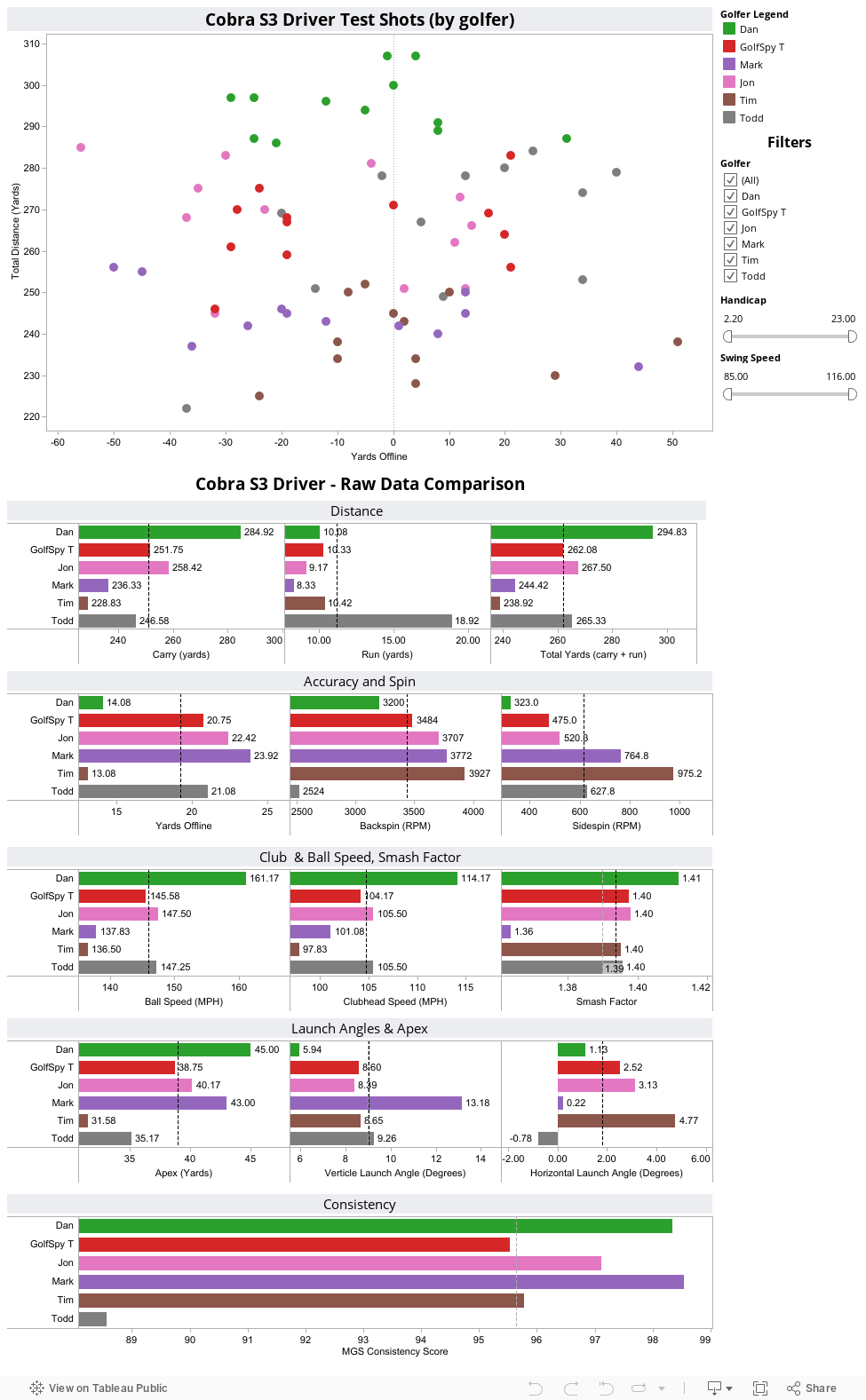
From the time we cooked up this ULTIMATE REVIEW system we've talked about not only the importance of actual data, but the importance of actually being able to show that data with our readers. What you see below is each and every shot that our 6 golfers took during the testing process for the Cobra S3 Driver. By now many of you are aware that hovering over any point on the map will give you all the pertinent details of that particular shot. Raw averages were compiled for each and every piece of data we culled from our simulators. If the screen looks a bit cluttered for your taste you can simply de-select any golfer to remove his data from the charts.
On each of the bar graphs, we include two reference lines. The dotted gray line will always represent the average for all golfers for whom we collected data. The dotted black line represents the averages for only those golfers you select. This way you are able to quickly see how the numbers from an individual, or sub-set of testers compares to both each other and the testing group as a whole. We also include sliders which allow you to filter golfers based on driver swing speed and handicap.
What to Look For
While it doesn't necessarily end there, the story of the Cobra S3 driver absolutely begins with distance. What's perhaps most impressive is that consistency of that distance. You'll notice that with the exception of Todd, the majority of each tester's shots are tightly clustered along a similar total distances (the Y-axis). Not surprisingly, average ball speeds are among the highest we've seen this year. And while not quite the K15, the S3 does a reasonable job of minimizing side spin.
How are we doing?
If there's anything you'd like us to try and add to these interactive pages we generate, stop by the MyGolfSpy forum and let us know. If it's possible, we might just do it.