PING K15 Driver - Interpreting the Data
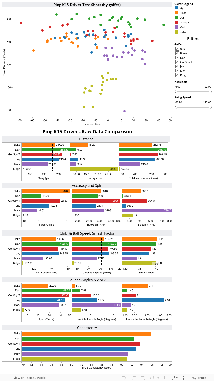
From day one of the new review system we've talked about not only the importance of data, but the importance of actually being able to share that data with our readers. What you see below is each and every shot that our 6 golfers took during the test process. Hovering over any point on the map will give you all the pertinent details of that particular shot. Raw averages were compiled for each and every piece of data we culled from our simulators. If the screen looks a bit cluttered for your taste you can simply de-select any golfer to remove his data from the charts.
On each of the bar graphs, we include two reference lines. The dotted gray line will always represent the average for all golfers for whom we collected data. The dotted black line represents the averages for only those golfers you select. This way you are able to quickly see how the numbers from an individual, or sub-set of testers compares to both each other and the testing group as a whole. We also include sliders which allow you to filter golfers based on driver swing speed and handicap.
What to Look For
What I find most significant about the K15 is that for the majority of our testers, it all but eliminated the right side of the golf course. When you exclude Mark from the result set, the left-side bias becomes even more pronounced. Remove Dan, and the discrepancy between left side and right side shots becomes downright remarkable. All of this, I think, illustrates why the PING K15 driver should be on the short list for anyone trying to eliminate the slice from his shot repertoire.
How are we doing?
If there's anything you'd like us to try and add to these interactive pages we generate, stop by the MyGolfSpy forum and let us know. If it's possible, we might just do it.